A design system for the field

Summary
Fieldwire is construction-management software for the people who run job sites, and part of Hilti since its acquisition. Its iOS and Android apps needed a mobile design system, and I built one backwards from production. I started from what the apps actually shipped, found the inconsistencies, and resolved each one into a single token, style or component in Figma. Color and type are variables with modes: light and dark for color, and for type the apps' native fonts, SF Pro and Roboto, plus Lato, the brand font the apps were meant to move to. Once the system was complete, every designer used it as their default. The engineers began fixing inconsistencies across the apps as soon as they found them, without being asked.

Team
Principal Product Designer (me), Head of Design (review and sign-off), design team (critique)

Role
Design System, Product Design

Scope
Figma design system library
Fieldwire's iOS and Android apps
23 components, 386 variants
12 renderings each: 2 platforms × 2 modes × 3 fonts
27 primitives, 62 color tokens
74 production screenshots audited
April to July 2024
The Problem
The apps in people's hands were the truth, and nothing in the design files held all of it. A new screen started with a designer looking for a kit. The kit rarely matched what production used, so neither did the screen.
- Production carried inconsistencies and one-off styles and components.
- Designers had to find a kit for native iOS and Android controls each time, so their screens were inconsistent with the app.
- Two platforms, each with its own native font and type scale, plus a brand font and two color modes, make too many combinations to keep in sync by hand.
So the system had to start from what the apps already were, not from a blank file. The file sets out three goals.
Goals
- Efficiency. Speed up designers, developers and QA.
- Accuracy. Improve the end product with more pixel-perfect designs.
- Focus. By making the process more efficient and accurate, spend less time on trivial UI issues and more on designing and validating the right thing.
Working Backwards From Production
I started from the shipped apps rather than a blank file. For each component, I screenshotted
every place it appeared in the Android and iOS apps and laid them side by side: 74 screens
across five components: lists, inputs, the top and bottom app bars, and search. Then I marked each one: keep it, add what's
missing (a count, a chevron), or question it when I couldn't tell where it was used.
What survived became a single component. I built the system on my own and brought the work
in progress to the design team's critique sessions as it took shape.
The option I didn't take was the more common one: design an ideal system and then ask
engineering to migrate to it. Starting from production meant the system was true on the
first day, and every fix after that brought the apps closer to it.
Color: From Primitives to Tokens
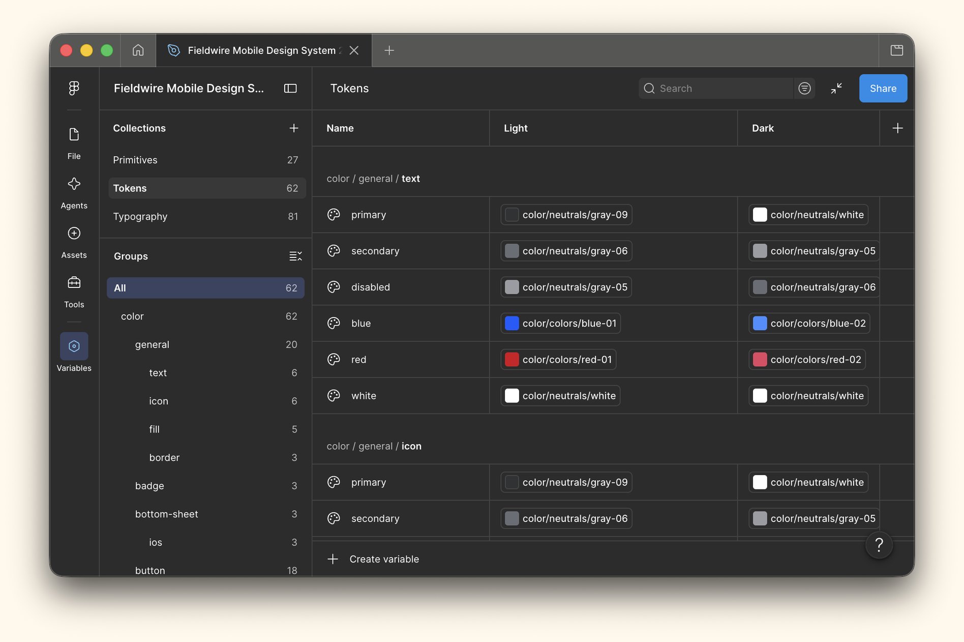
Color got the most structure. It is built in two layers of variables, primitives and tokens,
and the names do the enforcing.
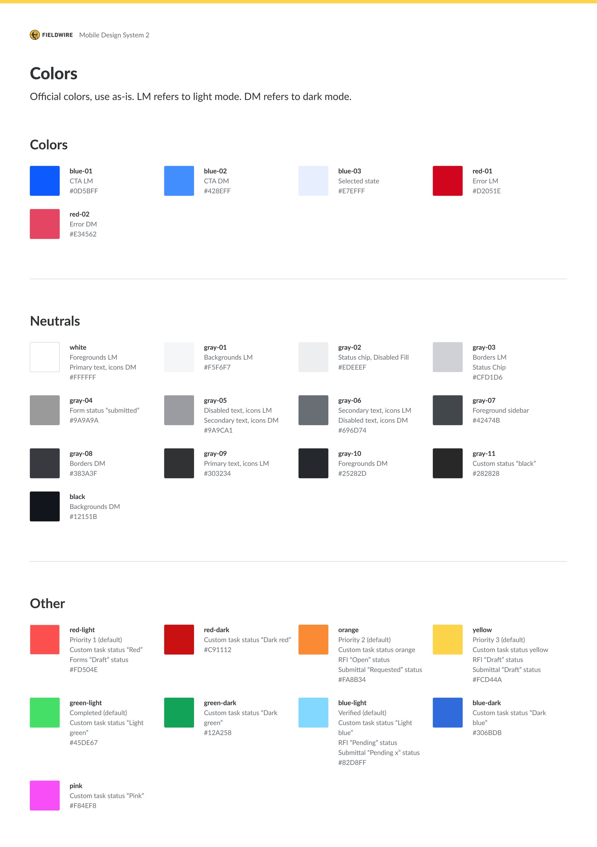
Primitives hold the palette. Every official color is a primitive, named
for what it is rather than where it goes: blue-01, red-01,
gray-01 to gray-10, and a set of accent colors. The palette
frame says it plainly: official colors, use as-is.
Tokens say where a color is used. 62 tokens sit on 27 primitives. A
token points at a primitive and names its job. General tokens cover the whole interface: text, fill, border and icon, such as
color/general/text/primary or color/general/border/default.
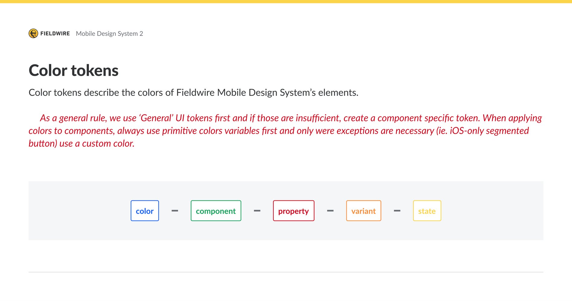
Component tokens follow one structure, color › component › property › variant › state,
so color/button/fill/primary/default reads the same way to a designer in Figma
as it does to an engineer in code.
One rule decides which to use. General tokens come first. A
component-specific token is created only when the general ones are not enough, and a custom
color only where an exception is unavoidable, like the iOS-only segmented button. That
keeps the token list short and every new token deliberate.
Light and dark are two modes of the same tokens. A designer or engineer who uses
color/general/text/primary gets the right value in either mode without
knowing what it is.
The alternative was one flat list of named colors used directly in components. That works
until a color changes, and then every screen has to be found and fixed by hand.
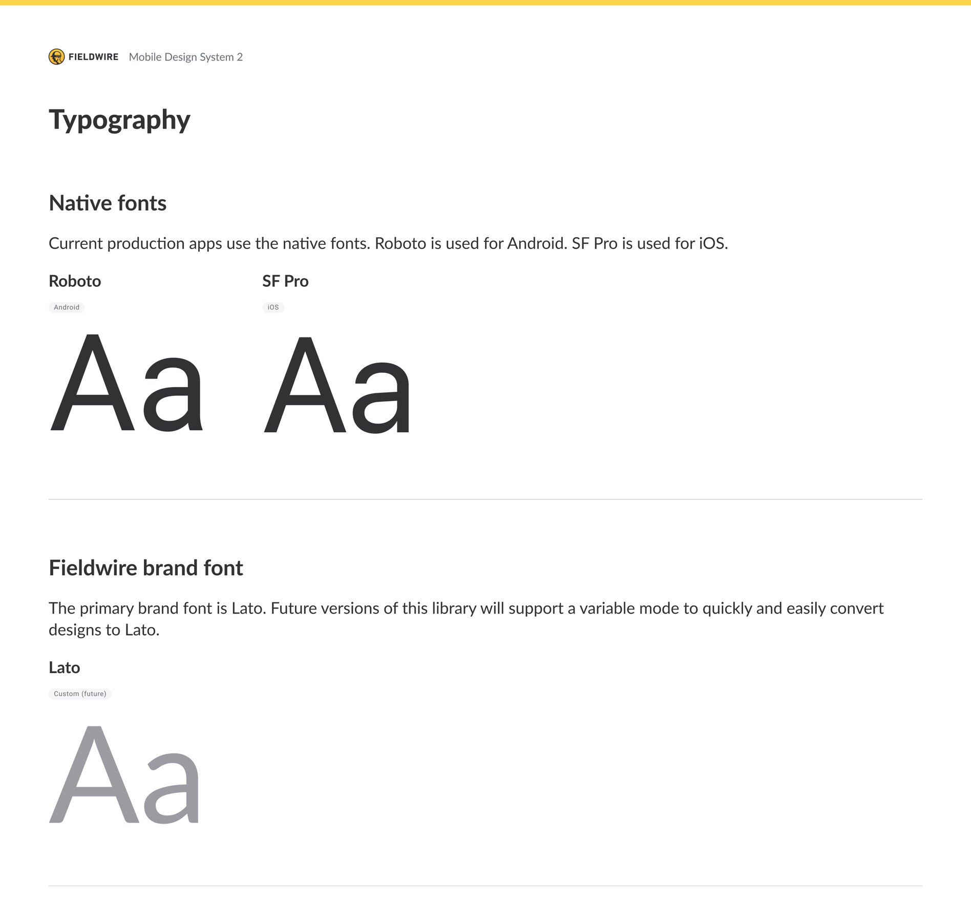
Type and Font Modes
All 47 text styles are built from variables, 13 for Android and 34 for iOS.
Size, line height, letter spacing and weight are each a variable, 81 in all, and each platform follows its own type scale: Android from
H1 down to the overline, iOS from Large Title down to Caption 2. A single font-family
variable feeds every style, and its modes switch the whole type system between Roboto on
Android, SF Pro on iOS and Lato.
Lato was the reason for the font modes. The apps used the system fonts, but
the plan was to move them to Lato, Fieldwire's brand font. I set up the font mode so that the
move would be easy when it came. Every component can be rendered on either platform, in light
or dark, in any font, by switching modes rather than redrawing a screen. The system was ready
for a decision the product hadn't made yet.
The alternative was a copy of the type styles for each font, and a Lato version to be built
when the migration was approved. Copies have to be kept in sync by hand, and that is how a
system drifts.
Native Where Native Ships
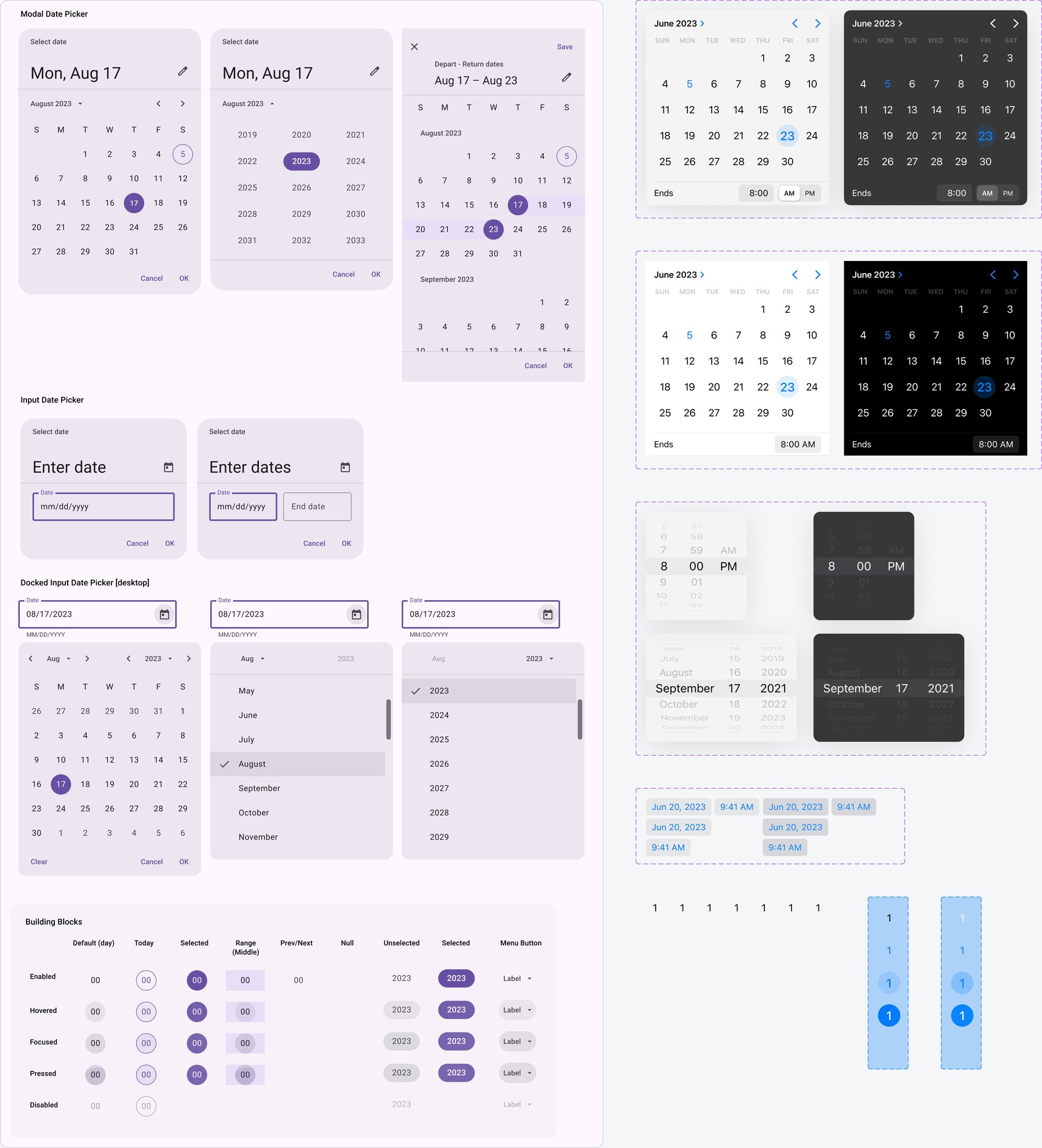
Where the apps used the operating system's own controls, the system says so. The system
page holds the iOS and Android defaults production used: status and navigation bars,
keyboards, and date and time pickers, in light and dark. A designer places exactly what the
app shows, instead of finding a platform kit each time and producing a screen that doesn't
match. When a platform updates, those components can be swapped out in one place.
Elevation follows the same rule. The app is flat unless a component says otherwise, and
where there is elevation, it comes from the platforms' own libraries: Material 3 for Android
and Apple's iOS 17 kit.
The alternative was to redraw native controls as custom components. That looks tidier in
the file, but it hands designers a version of iOS that doesn't exist.
Elements to Components
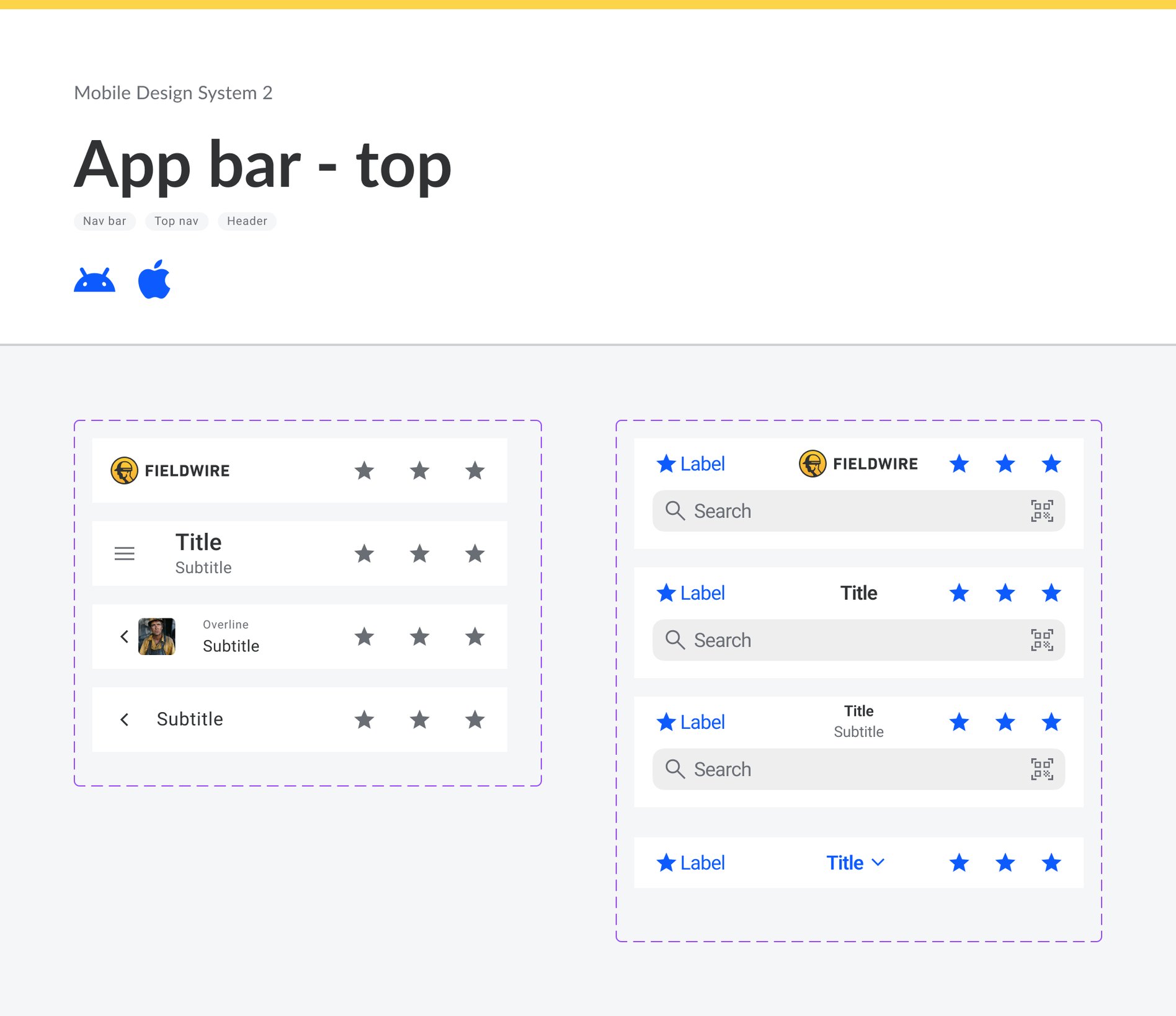
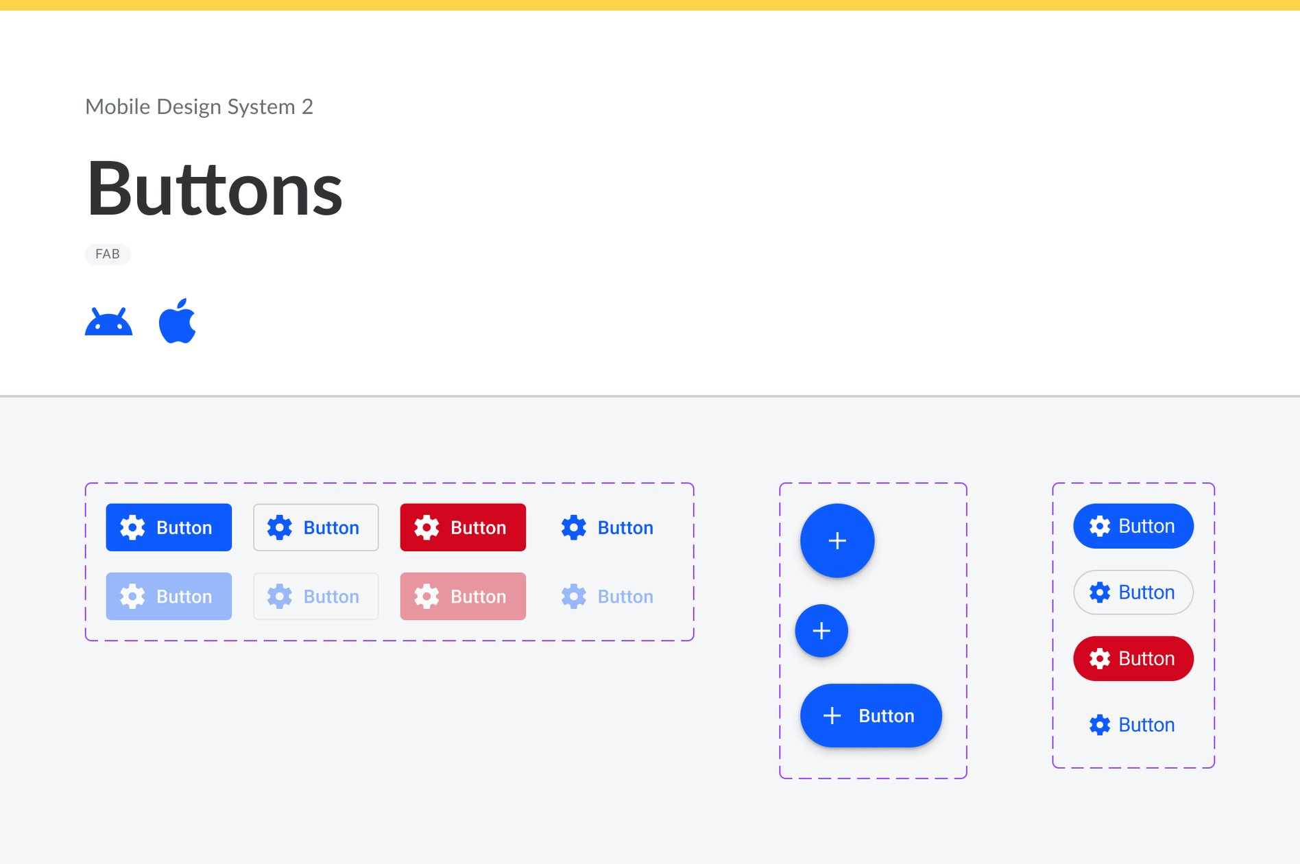
Small elements, such as the icon slot, the status chip and the logo, build into 23 components,
and those carry 386 variants across Android and iOS. Every component uses auto-layout,
so it resizes with its content, and many keep their building blocks alongside them: the
rows of an action sheet, menu items, tabs and page-control dots. The largest are the list,
with 116 variants, and the input, with 104.
One component per platform. My first attempt kept iOS and Android in a
single component with a platform switch, so the two could share properties and styles. It
didn't hold up: the platforms don't have the same properties (the Android list row has an
optional icon, the iOS one doesn't). So I split them by platform from the start. It is
easier to pick the right one from the assets panel, and it takes fewer clicks.
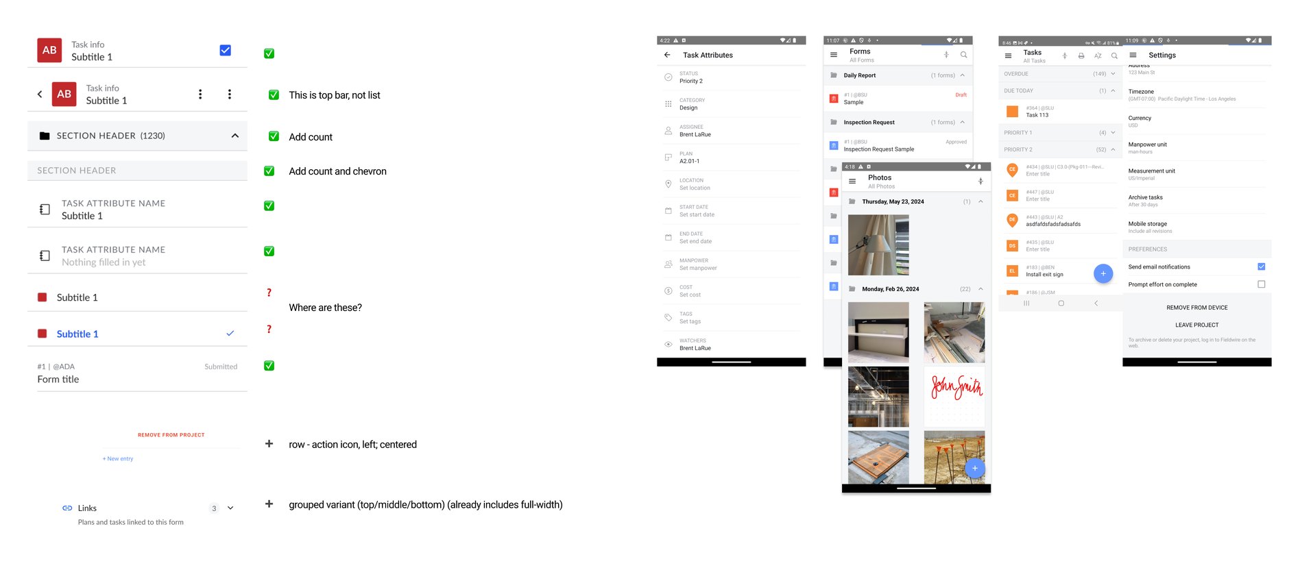
The list is where the unifying work shows most. Production had list rows
that differed in color, spacing, type and layout from screen to screen. I brought them onto
the same tokens, type styles and spacing, which gave 56 variants per platform: every style,
type and position. The newer list sets reduce that to two, assembled from building blocks.
Fewer, composable components are easier to keep consistent than one variant for every
combination.
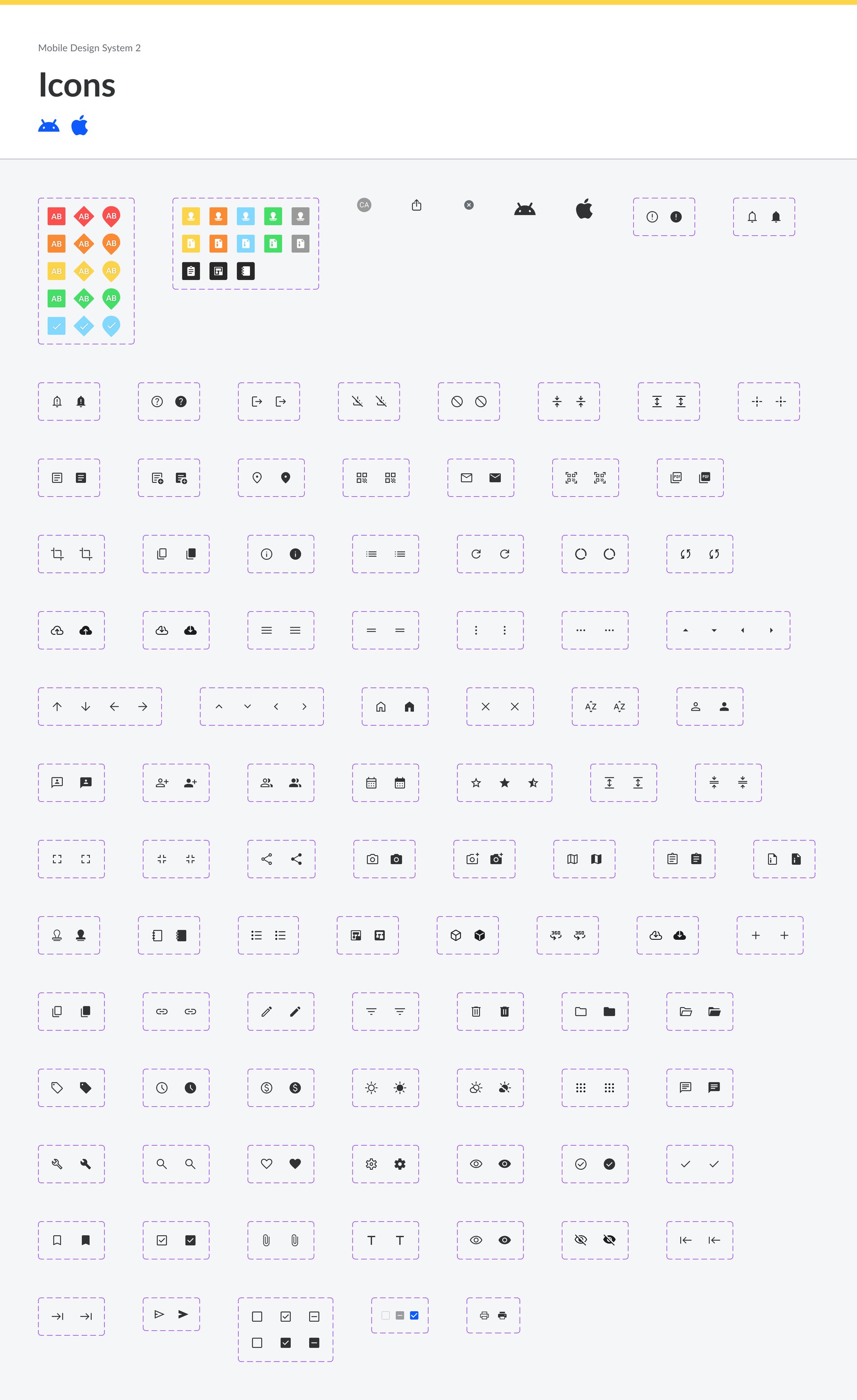
The icon library sits alongside, with Fieldwire's own construction icons, such as plans,
RFIs, submittals and task status, next to the general set.
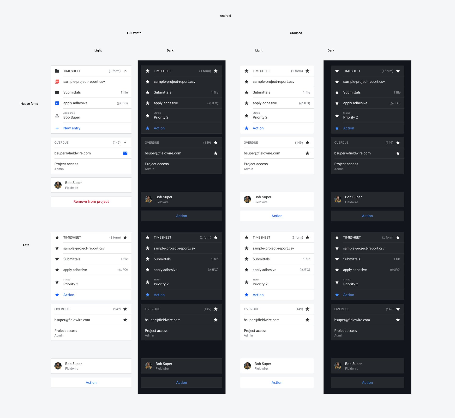
The Stickersheet: Components in Real Screens
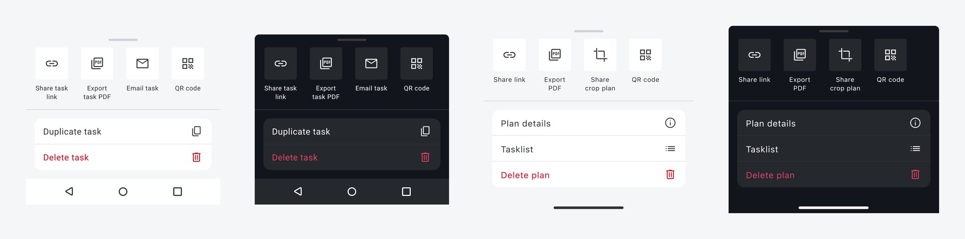
A component page shows every variant a component has. It doesn't show which one a screen
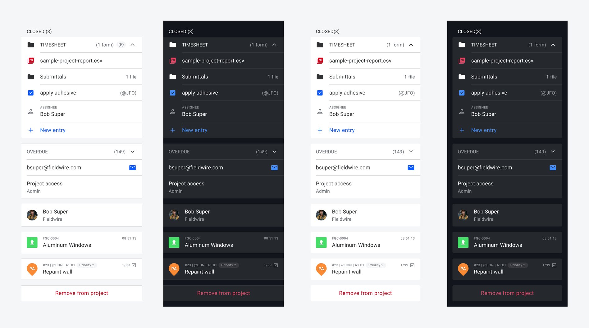
needs. So the stickersheet rebuilds actual Fieldwire screens from the system's components:
the task and plan actions, the app bars over Tasks, Plans and Settings, the lists of forms,
files and assignees. Each one is shown on Android and iOS, in light and dark.
It makes the system immediately clear in use. A designer sees how the variants come
together in the product they already know, and anyone reviewing the system can check it
against the app on their phone.
The alternative was a grid of every variant side by side. That proves coverage, but it
leaves the designer to work out how the parts fit together.
Documentation Inside the File
At Hilti, the design system's documentation lived in Confluence, one step away from the
work. For Fieldwire I kept it inside Figma. Every frame uses the same documentation
components: a header with the title, a status chip and the platforms it covers, plus
dividers and annotations. New components are marked as new and old variants as deprecating,
so a designer can see where each part of the system stands.
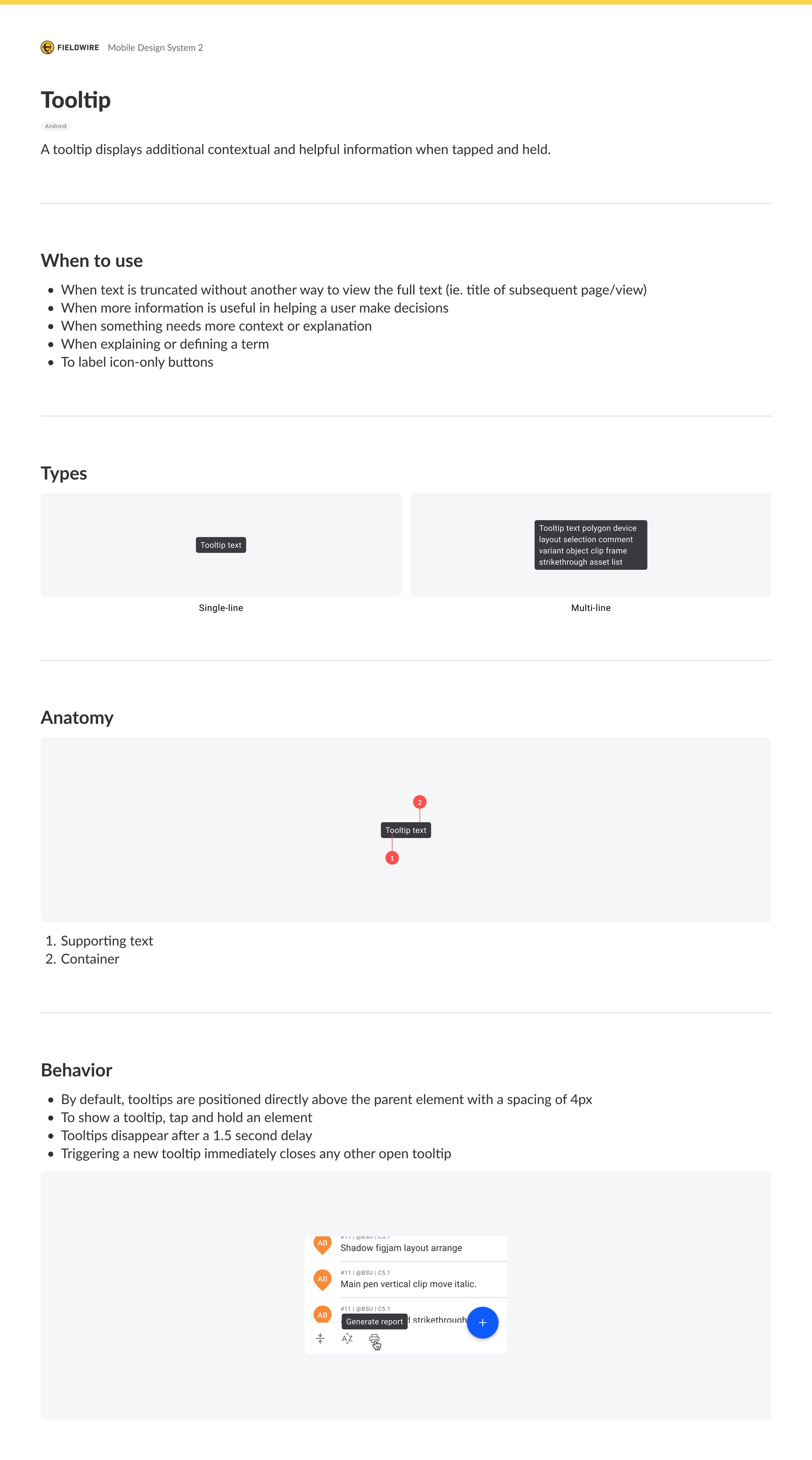
The tooltip guideline shows the form a guideline takes. It covers when to use a tooltip:
truncated text, a decision that needs more information, a term that needs defining, an
icon-only button. It shows the single-line and multi-line types and the anatomy. It then
sets the behavior: the tooltip appears 4px above its element on tap and hold, disappears
after 1.5 seconds, and closes any other open tooltip.
Where It Ended
The system became every designer's default. The engineers took it on as their own. When one of them found an inconsistency, or a one-off style or component, they fixed it across the apps without waiting for it to be prioritized. I handed the system to the design manager when I left for Circle Medical in July 2024.
What I'd Do Differently Now
I built this system before AI agents designed and wrote interfaces. It was made for people,
and people kept it true. Today the same system would also have to guide an agent, and an
agent without guidance drifts to whatever looks plausible.
Write every decision down where an agent reads it. The token rule and the
tooltip guideline were written for people, on frames in Figma. I would also record each
decision in a spec file when it is made, and give every variable and component a description
and every variable its SwiftUI and Compose code names. Then an agent chooses from a closed set
of named values instead of inventing plausible ones.
Connect the components to the code. I would use Code Connect to map each
component, the native ones included, to its SwiftUI and Jetpack Compose code. Then an agent
uses the real component instead of redrawing it.
Check for drift rather than instruct against it. A rules file tells an agent
what to do, and a check finds out whether it did. The engineers' habit of fixing
inconsistencies as they found them was drift control done by people, and today I would make it
a routine. I would scan the files on a schedule for hard-coded values, text set outside the
type styles, and detached components. And whenever a variable or component changed, I would
flag every piece of documentation that mentions it, so that no one, person or agent, works
from a rule written for an older version.
Credits
Nick Kinling: Head of Design, Fieldwire (review and sign-off)