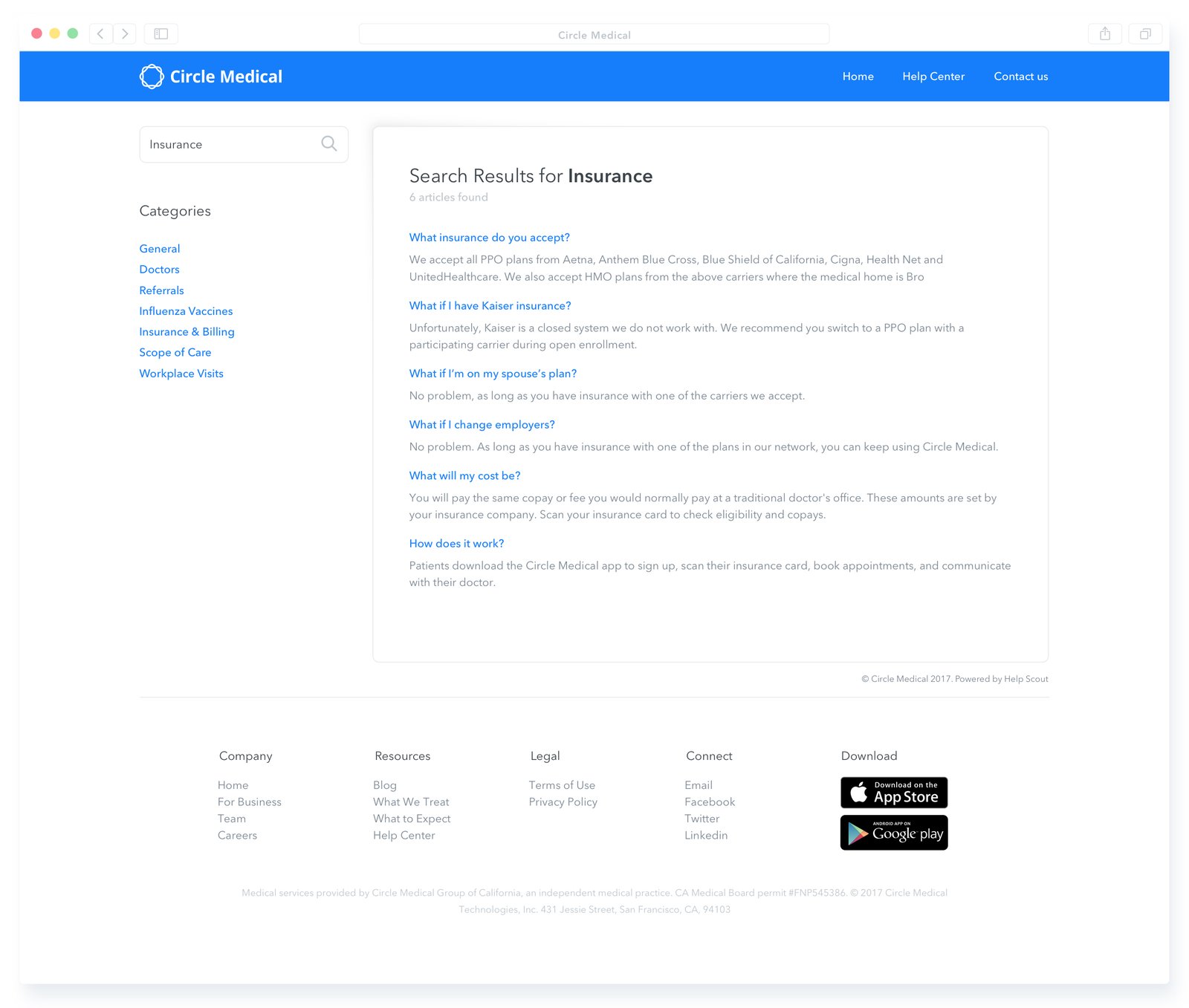
The doctor's office that comes to you

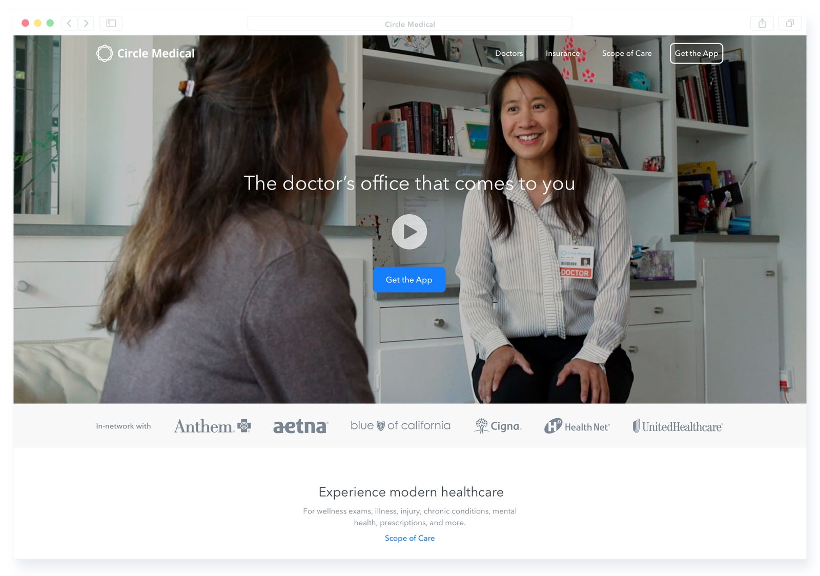
Summary
The website was where patients learned about Circle Medical and checked it out before trusting it with their care: who the doctors are, which insurance it takes and what it treats. Every page led to one action, getting the app.
The homepage's cover video begins the story for a new visitor. The whole of it is told at a glance, and once their interest is piqued, the page carries it on.

Role
Co-founder, Product & Design

Scope
Homepage, app download, doctors, insurance, employer micro-sites, testimonials and help center
Call to Action
Get the app from any device. A subtle but hard-to-miss call to action is always on the page, so the one thing we wanted visitors to do was never missed and conversion stayed high. Visitors are sent straight to the right app store, or texted a link to their phone.

Doctors
Your primary care physicians. How we presented our doctors was shaped by user research, a key research paper and iteration. What we found led to a clean, professional look.

Insurance
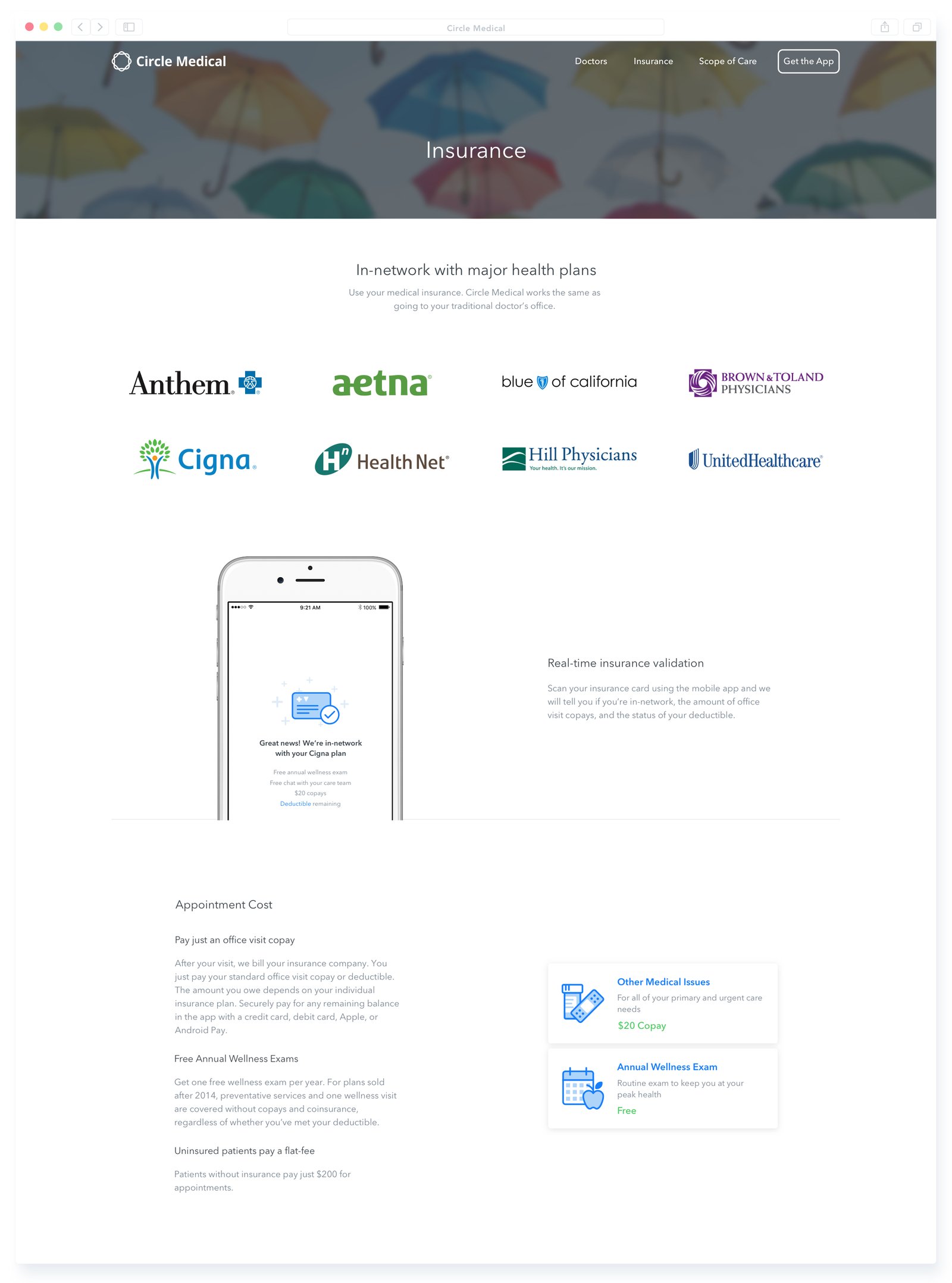
Simple and easy to understand. The design challenge with insurance is to educate without intimidating. Our approach was transparency, information relevant to the moment, and further levels of detail for those who look for them.
Corporate Micro-Sites
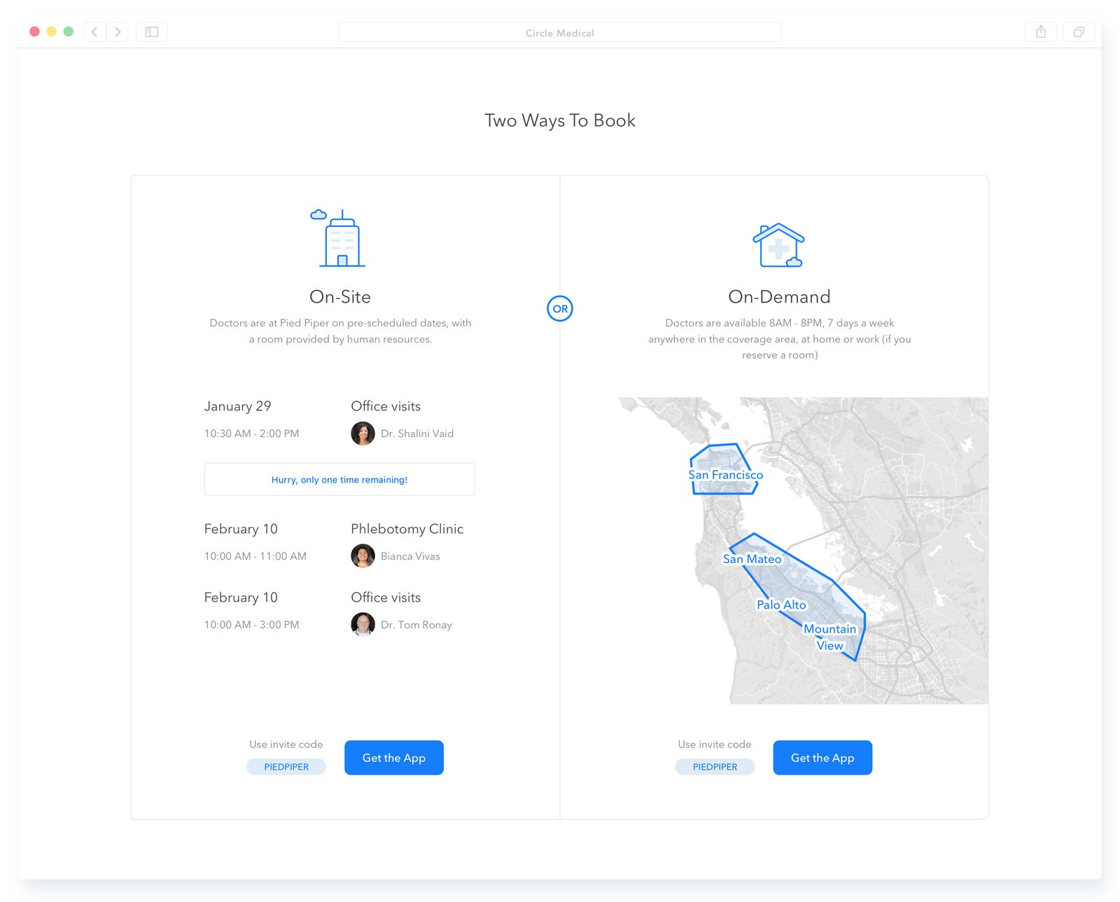
A custom website for every employer. We wanted our clients to look like heroes, so we built co-branded sites for them to send to their employees, which made communicating the benefit simple and effective.
Testimonials
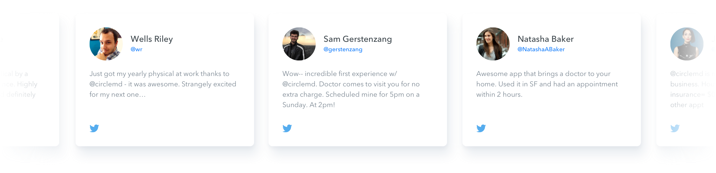
It gets the people going. Word of mouth is one of the most common ways people find a new doctor, and our patients sang our praises. We knew they were happy because daily NPS surveys were consistently above 80.
Help Center
Help that just won't quit. Information is power: a regularly updated help center, with the most popular questions surfaced on its landing page, answered visitors' most pressing questions.