Practice automation for private practices

Summary
Swiss private practices run on the telephone. The medical practice assistant (MPA) at the front desk is receptionist, scheduler, lab liaison and billing clerk at once, and every call interrupts one of the others. Springli was an AI agent that took over the practice's patient communication end to end: reminders, rescheduling, lab results, recalls and no-show follow-ups, over SMS, in the patient's language, connected to the practice management system (PMS). I led product and design: the scope, the interaction design, how the AI discloses itself, the brand, and the landing page, which I also built.

Team
Co-founder (me), marketing & research, prototype & app development

Role
Co-founder, Product Design, Brand, Landing Page Design & Build

Scope
7 practice interviews, from owners to MPAs
PMS vendor outreach in five countries
Landing page in English and German
The Problem
Ana recruited the practices, wrote a bilingual interview script and ran the interviews, from practice owners to lead MPAs, in seven practices in Switzerland and Slovenia. I took the other side of the market: the vendors of the practice management systems that every practice's day runs through, including the creator of Elexis, Switzerland's open-source PMS.
- In a multi-doctor GP practice, MPAs spent about 80% of their day on the phone, across roughly 300 calls a day.
- In a GP group practice, calls took more than half of front-desk time, and the interruptions caused billing and lab mistakes.
- One practice had no proactive outreach at all for vaccinations or check-ups.
- An optician chain found that going digital had added admin work rather than removed it.
One line from our inventory of MPA tasks decided the product: "If a task ends with the MPA copying data from Springli into the PMS, the value proposition collapses to a smart drafting tool." Springli had to finish tasks, not suggest them.
Design Principles
- The agents are the product, not the dashboard. If an MPA spends more than 30 minutes a day in Springli, it has failed. What she needs is a patient context card she can pull up in five seconds.
- Doctors set the policy, Springli carries it out. No clinical decisions, ever.
- When in doubt, route to the MPA. And never send a patient back to the phone.
- Disclosure is an identity, not a warning label.
Decisions That Shaped It
SMS, not WhatsApp. The first channel spec was WhatsApp-first. SMS cut the time
from signing a practice to its first patient message from about five weeks to about 48 hours,
and it solved the data-residency problem.
No patient portal or app. "Portals are where messages go to die."
Patients get the message where they already read messages.
No workflow builder. If a practice has to assemble its own automations, the
product has failed at being AI-native.
How the AI introduces itself. Every message comes from a named sender, the
practice's AI assistant (KI-Assistent in German). The first message says plainly that
it is an AI. Later messages carry no label, and replying Mensch, German for
"human", reaches a person at the practice.
A Brand That Isn't Blue
Every competitor in this space is blue, so Springli is orange, #FF4400. The name
carries a coiled spring, the season, Zürich's Sprüngli, and the Swiss diminutive -li.
A serif display face sits over Inter for body text, and the voice is set at 60% precision,
40% warmth. Anything external had one test: would Stripe publish this?
In Figma I built only the foundations the landing page needed: type scale, color, logo,
radius, spacing, icons from Iconoir, and a few components.
The Orb
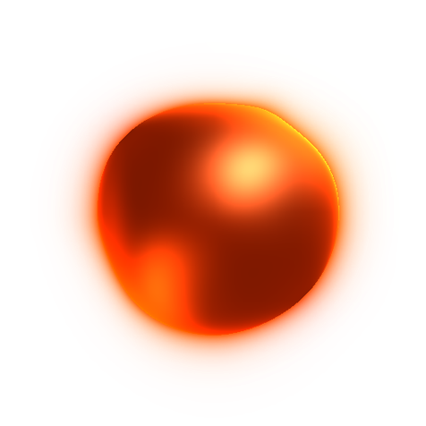
The hero needed a picture of something with no face: an intelligent system working quietly in
the background. I drew an orb in Figma, but what shipped is very different, and it came out of
a day of experiments in code on 14 April 2026.
It started as a Canvas 2D orb with a drifting highlight. I replaced that with a WebGL2
raymarched sphere whose surface is displaced by noise, adapted from a ShaderToy shader and
recolored from blue into the brand oranges. The transparency took two passes, and a front fill
light stopped the center from going dark. Around it, messages type themselves out. Before settling on
two cards placed so they never collide, I tried connecting lines with a traveling dot, a single
centered card, and three cards.
The surface never repeats, so it reads as something alive and at work, without a robot or a
chat bubble. The orb at the top of this page is that shader.
The Landing Page
The landing page is where all of it came together. I designed and built it with AI coding agents: Next.js, English and German, 80 commits between 10 and 21 April 2026. One rule from the brief held throughout: no section labels. If a headline needs a label to explain it, the headline isn't good enough. The motion does quiet work: sections reveal as you scroll, the numbers respond on hover, patients and their replies rotate through the languages section, and the three setup steps stay pinned beside a phone as you read them.
Where It Ended
We stopped in the summer of 2026. PMS vendors gatekeep access to their systems, and an agent that finishes tasks cannot work without it.
What I'd Do Differently
Test distribution before design. Whether PMS vendors would let us in was the
question everything depended on. I would run those conversations in the first week, before the
brand and the landing page.
Redo the logo. Once it was on screen, the stacked coil read as Stack Overflow's
mark, and anyone who works in tech would see it. At a validation stage that didn't matter;
before any launch it would have had to be redone.
Claim only what the evidence supports. Our "PMS-agnostic" positioning
turned out not to be a differentiator in Switzerland, where competitors already covered every
major vendor.
Credits
Ana LaRue: marketing & research
Henrique Serro: prototype & app development