Payments made easy and a world's first
Summary
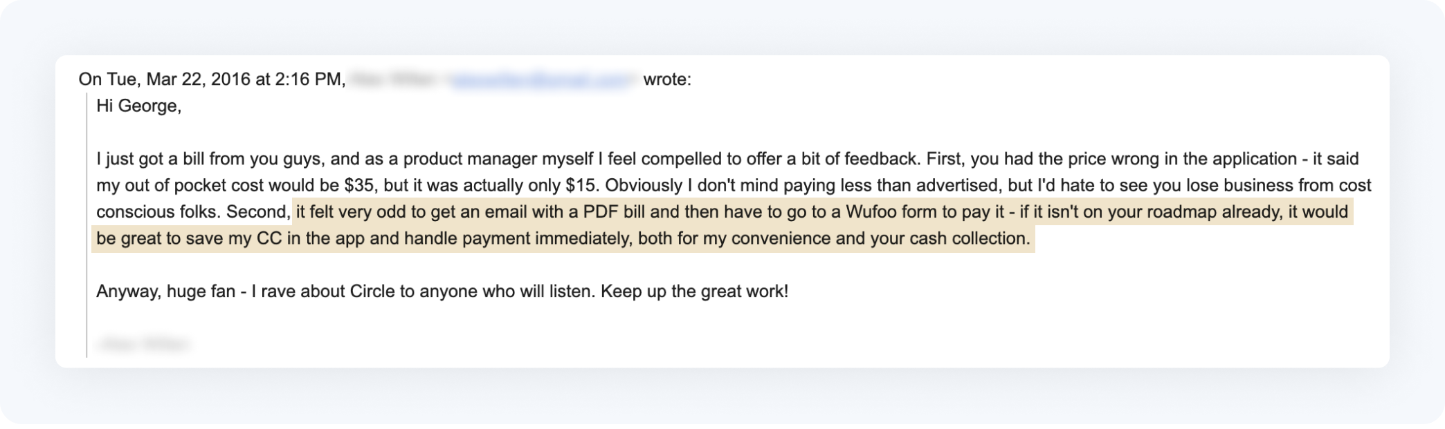
Circle Medical started as primary care doctors who came to your home or work. Today, it's one of the major players in the US telemedicine market. When we released our payments feature, we were still using an MVP version where we emailed a PDF bill and users paid through a Wufuu form. After releasing real-time insurance verification, the next step was automating payments. As usual, we did more than the typical medical experience and became the first medical practice in the US to accept Apple Pay.
Team
CEO, CTO, iOS Developer, Android Developer
Role
Co-founder, Design Director, Product Design, User Research
Impact
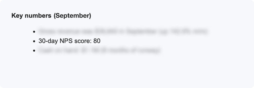
Increased NPS score by ️⬆+11%
1st medical practice in the US to accept Apple Pay
The Problem
Before, our payment MVP was not very good and required a lot of manual effort. People noticed and told us how we could improve it. We knew we needed to make changes to make it better and easier to use, and to make our business run more efficiently. So we decided to automate payments and improve the user experience.
Design Principles
- User must receive bill before the insurance company
- Bill must be easy to understand
- For those who don't want to be bothered, let them pay automatically
For this feature, I established 3 core design principles. The user had to receive the bill before the insurance company to avoid being perceived as a bad actor. This wasn't difficult since the insurance company usually took weeks to send the information, while we could initiate the bill immediately once the claim was processed by the insurer.
Many user tests revealed emotional scars from unexpected and expensive medical bills. Fear of a large bill is a justified fear, but it can be partly mitigated by transparency about pricing, explanations and support about bills, and timing of information.
Existing interaction with patients revealed a wide range of preferences regarding payments, from those who accepted the price and wanted to pay without being bothered, to those who were very price-sensitive and wanted to minimize costs with things like deductible plans, HSA accounts, and spending on various cards.
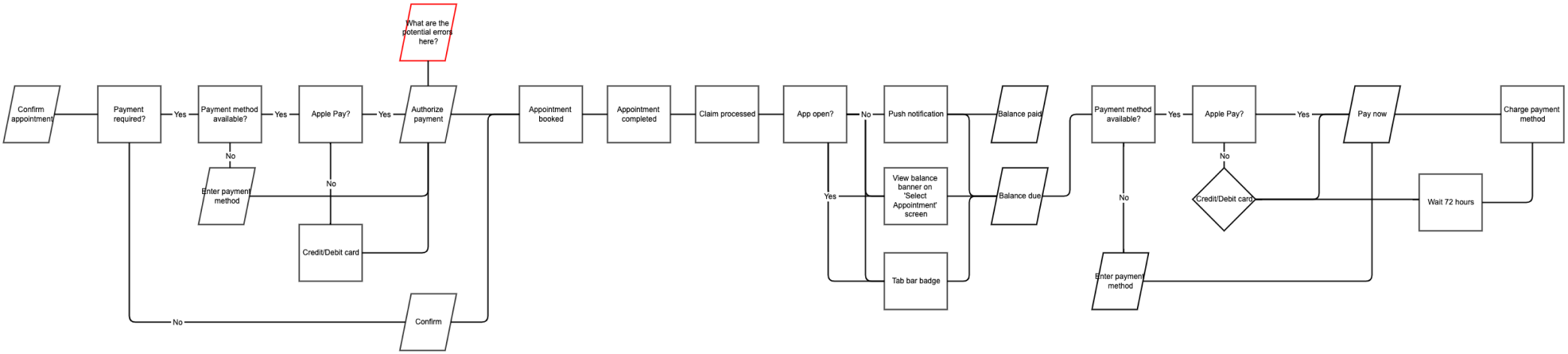
Flow Diagrams
I used a flow diagram to capture the full process including system and user actions.
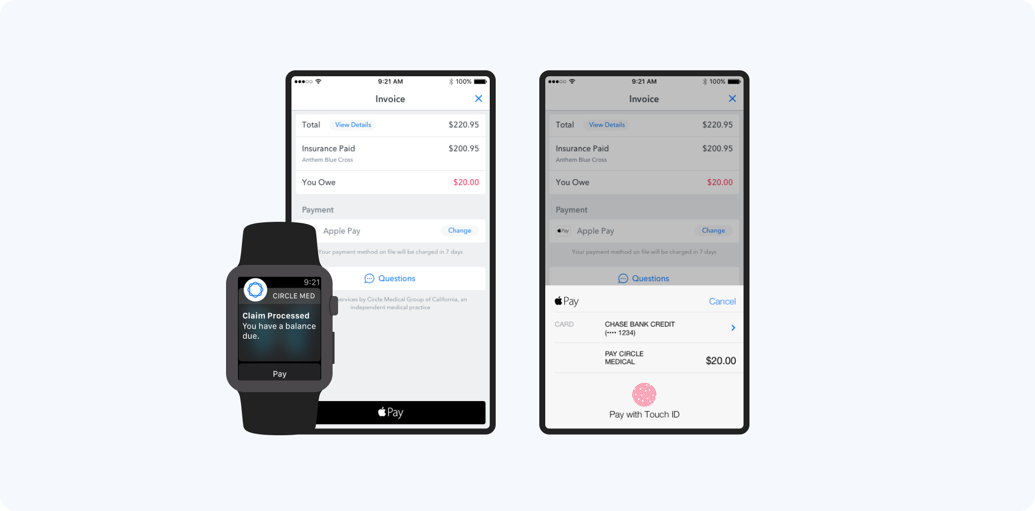
At this step, I learned we couldn't use Google Pay. Apple Pay was a new consumer feature in the market and it had the potential to save our users time and effort. If the user already had Apple Pay set up, we could show it as the default payment method and prevent the user from re-entering card information. Unfortunately, with Google we couldn't show the payment option only if the user had already set it up. This added extra choices and effort for the user, so we chose to omit Google Pay.
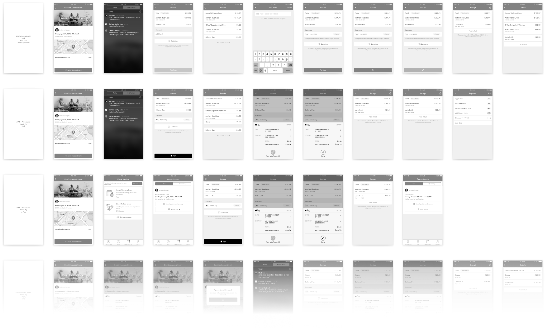
Wireframes
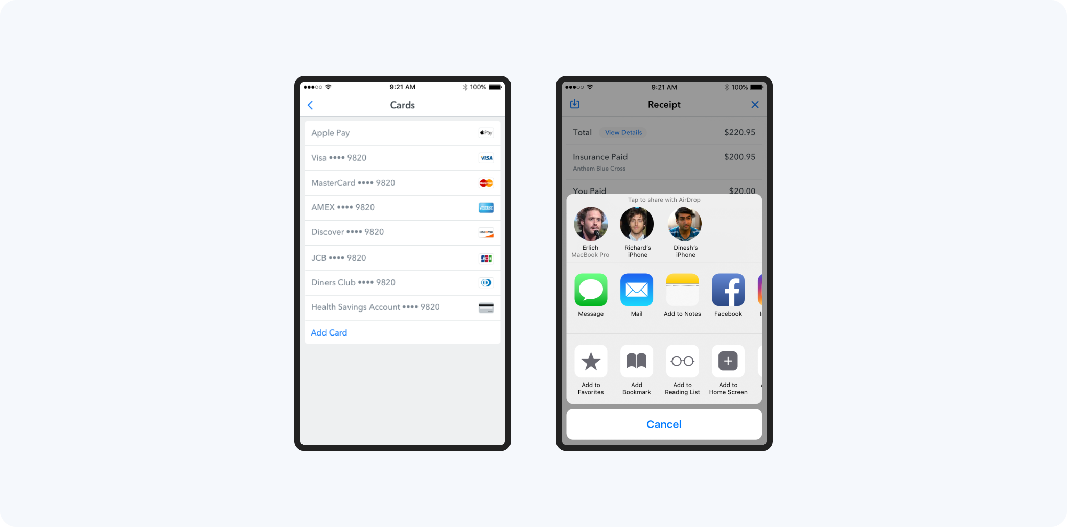
I used wireframes to capture each scenario before user testing. This included push, in-app, and email notifications, authorizing the use of cards for copays and automatic payment processing after appointments, various card types, card management, cancellations, and more.
Mockups
With the selected mockups below, you can see one of our more difficult scenarios that had to be solved. Here the user booked an Annual Wellness Exam, which is covered by their insurance plan. But because of a more serious medical condition during the appointment, the insurance plan no longer fully covers the appointment. Users who care can find out more by looking at the details, and those who don't can simply pay and move on.
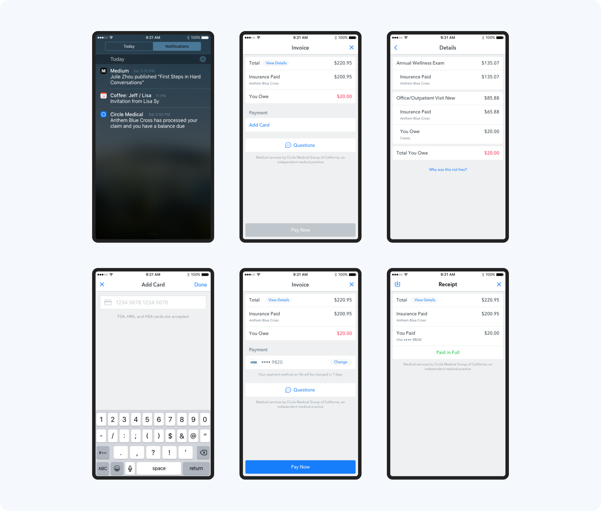
Health Savings Accounts (HSA) and taxes
During testing, I learned that some users wanted to pay with their HSA cards and others wanted to save their bills for tax purposes. These were things that I didn't consider before, but I added them to the feature because they were important to our users.
Prototype
Invision screen hotspot prototype – no longer available 👻
User Testing
4
30
in-person, moderated
2:2
I tested every feature with users before we started developing it to save time and money and make sure we were giving the best possible experience to our users. For this round of testing, I used a mix of new and existing users. New users were recruited through Craigslist and screened prior to participating and existing users were people who had already used our app.
The test was divided into 3 parts: 1) pre-test questions 2) tasks 3) and post-task questions. The main part of the test, where users had to complete tasks, was a interactive prototype with hot spots.
I tested for:
- The ability to complete payment
- Clarity of payment responsibility
- Ease of experience
- Reaction to 'No copay' vs. 'Free' copy
The goal was not to get exact, statistically significant results, but to test our assumptions and see what we might have missed.
- Some users preferred automatic payment immediately, others appreciated the time to ensure money is in the correct account. 4/4 said 7 days would be enough time.
- 'Free' was preferred to 'no copay'
- Don't charge the copay until the appointment
Solution
Despite having issues with payments in the past, we knew we needed to get real-time insurance verification working first. The payment feature was well received and the options to use Apple Pay and get notifications on an Apple watch made it even better.
Impact
Increased NPS score by ️⬆+11%
1st medical practice in the US to accept Apple Pay