Real-time insurance verification
Summary
Circle Medical started as primary care doctors who came to your home or work. Today, it's one of the major players in the US telemedicine market. We were the first among our competitors to accept health insurance. Real-time insurance verification lets users check if we accept their insurance directly in the app without needing staff or doctors.
Team
CEO, CTO, iOS Developer, Android Developer
Role
Co-founder, Design Director, Product Design, User Research
Impact
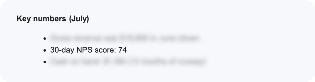
Increased NPS score by ️⬆+8%
Saved ~5 min (~15%) per appointment
Removed major pain point for doctors
The Problem
We were the first among our competitors to accept health insurance. This caused problems because there was no standard way to collect and check patients' insurance. At the time, we had no physical office and doctors went straight to patients' homes. This made it difficult and frustrating for doctors to take insurance during appointments. There were also issues because we couldn't verify insurance in real-time.
I learned two key things from my research and weekly conversations with patients that helped guide our business, product, and design decisions. This feature helps save time and makes it easier to understand health insurance.
The top two reasons for not going to the doctor
- No time
- Don't understand health insurance
I also had three main design principles that influenced our product design. The patient experience from onboarding to after their appointment was a differentiating factor from our competitors and traditional medical clinics. I took Jakob's Law a step further and believed that interacting with doctors should be the same as interacting with friends and family.
Early user research and my own experience with the medical system helped shape the last two principles and created shorter, more meaningful experiences.
Design Principles
- Provide the same experience as world-class consumer apps, despite being in healthcare
- Never ask for the same information twice
- Never ask for information you don't use
Flow Diagrams
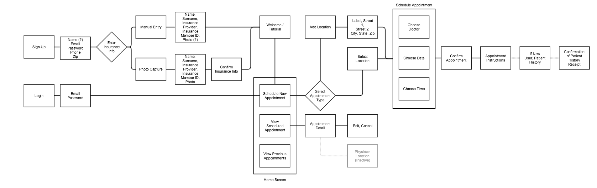
I made diagrams to understand the full impact of accepting health insurance. I knew I had to find solutions for situations like patients without insurance, out-of-network plans, and how it affects prices. It also raised UX questions about whether users with insurance would prefer to book first or give their insurance information first. Since we weren't a well-known brand, maybe patients wanted to learn more about the doctors and the practice before giving their insurance information before the appointment.

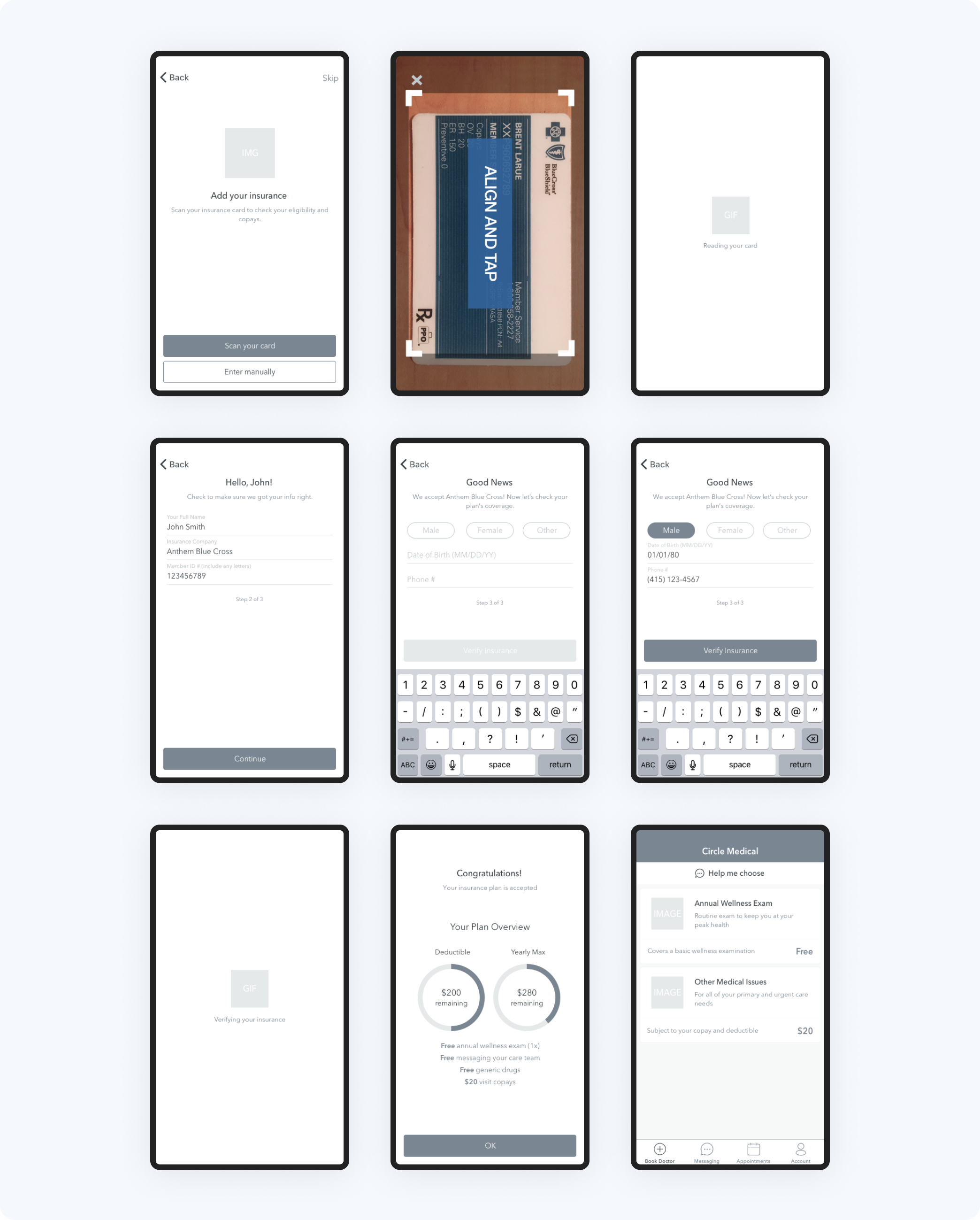
Wireframes
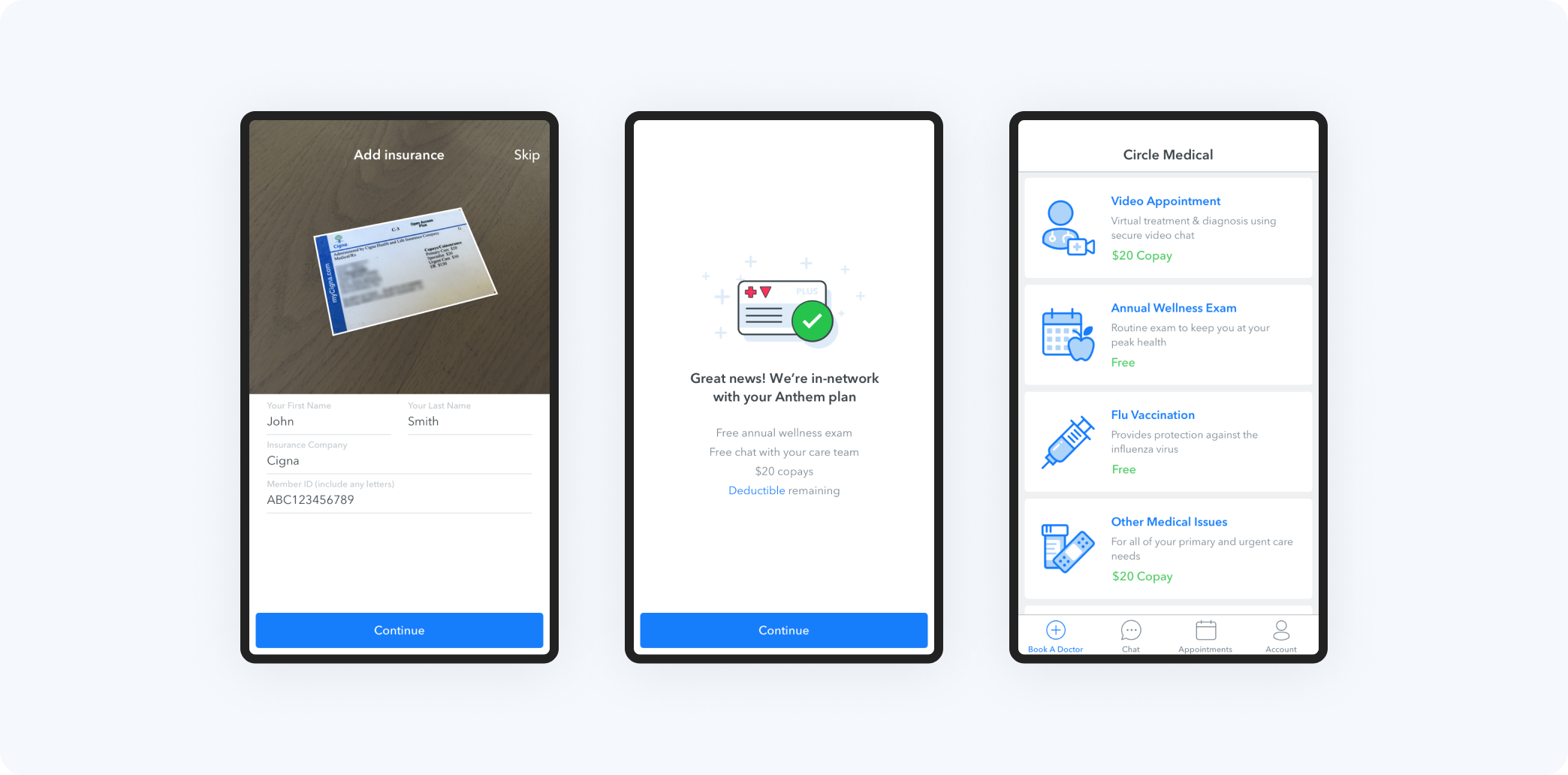
Checking insurance in real-time helped us fix insurance issues through the app before they became big problems that took a lot of time and resources to fix. It also matched our first design principle. People were already used to and liked when their credit card was automatically read and payments were processed immediately.
Mockups
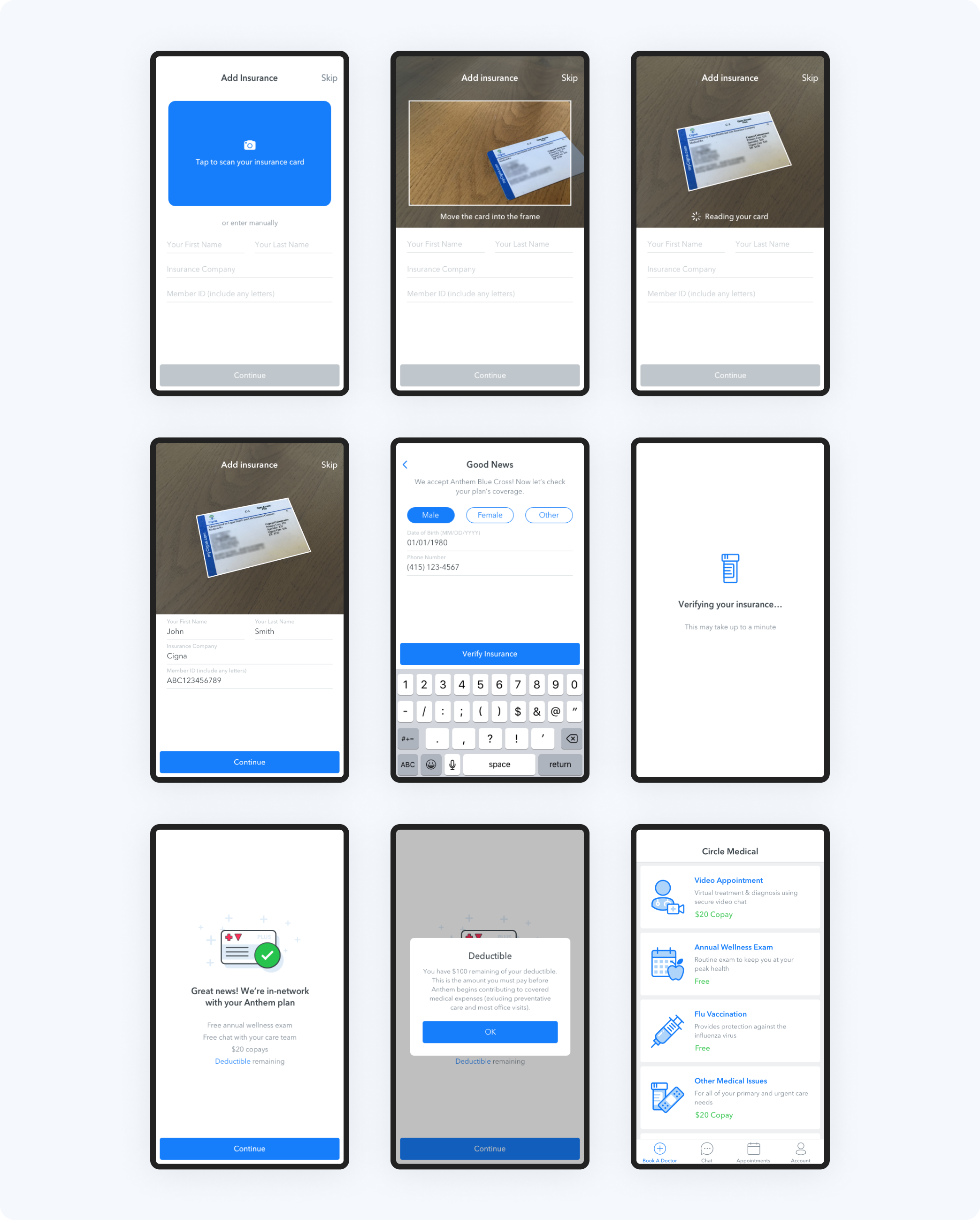
The mockups below show what we learned from testing with users and working with technical team members. See the results of the testing below. I learned from testing that users have the existing mental model from traditional medical clinics, where they expect to enter insurance information first. With this information and working with our talented iOS developer, we were able to improve the experience and make the process of scanning cards significantly better.
The insurance verification animation is also a UX improvement based on research about the perception of waiting times. Because there could be a wide range of wait times, I chose a more interesting animation to make it feel shorter.
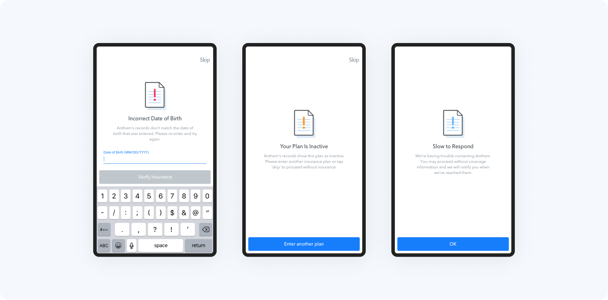
Errors
Health insurance is not only confusing and frustrating for patients, it is also one of the largest expenses for medical practices. It takes a lot of time and resources to deal with insurers, process claims, and fix insurance problems.
One big reason for the big impact on NPS was solving not only the easy problems, but also the many insurance issues. I categorized these errors into three groups based on whether the user could fix the issue on their own. At the time, we had to solve for over 15 specific errors. Because all of this is done through the app without human help, it saves a lot of time and money.
Prototype
Invision screen hotspot prototype – no longer available 👻
User Testing
5
30
in-person, moderated
4:1
I tested every feature with users before we started developing it to save time and money and make sure we were giving the best possible experience to our users. For this round of testing, I used a mix of new and existing users. New users were recruited through Craigslist and screened prior to participating and existing users were people who had already used our app.
The test was divided into 3 parts: 1) pre-test questions 2) tasks 3) and post-task questions. The main part of the test, where users had to complete tasks, was a interactive prototype with hot spots. Since we were the first of our competitors to offer health insurance, one of the biggest questions was whether users would want to enter their insurance during sign-up or only when booking an appointment.
The goal of this test wasn't to get exact, statistically significant results, but rather test our assumptions, test usability, and uncover what was in our blind spot.
- 5/5 users preferred to provide insurance upfront as part of sign up. Because this is a medical app, they assumed they would be adding insurance. I optimized the solution to match this expectation, but allowed users to skip adding insurance for those who prefer to do it later, don't have insurance, or have insurance from an out-of-network carrier. This option is deemphasized in the experience.
- People don't fully understand how their health insurance works, so the big dials and numbers about their deductible and yearly max were confusing and not helpful. Because of this, I decided to hide this information and only show deductible status. I didn't show the data visually. People who understand their plan may be interested in this transparency, but those who don't shouldn't be bothered by it.
- During this test, I discovered a pattern with how users find their doctors. This led to an integration that was a big inflection point in our future growth.
Solution
The final solution is the result of all the research, collaboration, testing, and work by myself and an amazing team. It not only looks and feels good, but it solves specific problems based on real learnings from our existing and target users.
Impact
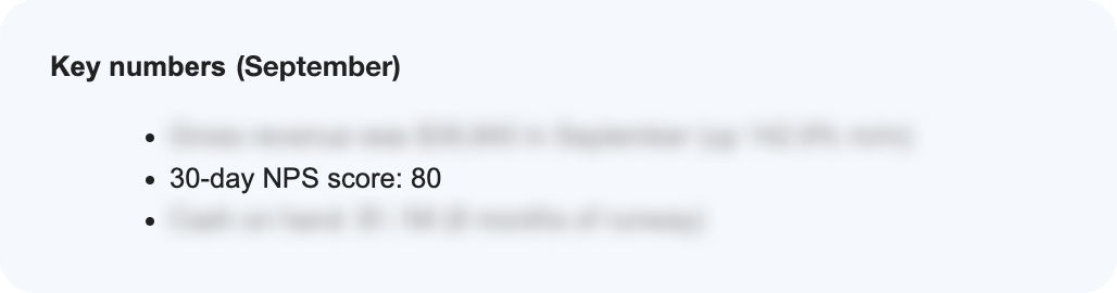
Increased NPS score by ️⬆+8%
Saved ~5 min (~15%) per appointment
Removed major pain point for doctors