Test-driven approach to merging two flagship apps
Summary
Hilti's leadership wanted to test the UX feasibility to merge two of their flagship apps into a single app which covered tool management, connected tools, and repair use-cases. The two apps, ON!Track and Connect were two of Hilti's largest and most used apps.
Team
Head of Marketing, CPO, Product Manager, Lead Developer
Role
Product Design, User Research
Impact
Demonstrated UX feasibility of merging applications
Significantly reduced risk of poor performing features
Vision
Hilti's leadership desired a simple message to customers and the sales team (>15,000 people): We have a single app for all tool management use-cases. No matter the custom (owned, subscribed, loaned, under warranty), the user would have access to all the the relevant features for a given tool to efficiently and effectively manage their tools.
Problem Statement
Find the best path to merging the two apps in the context of the current tool management SAAS app rebuild.
UX Feasibility Assessment
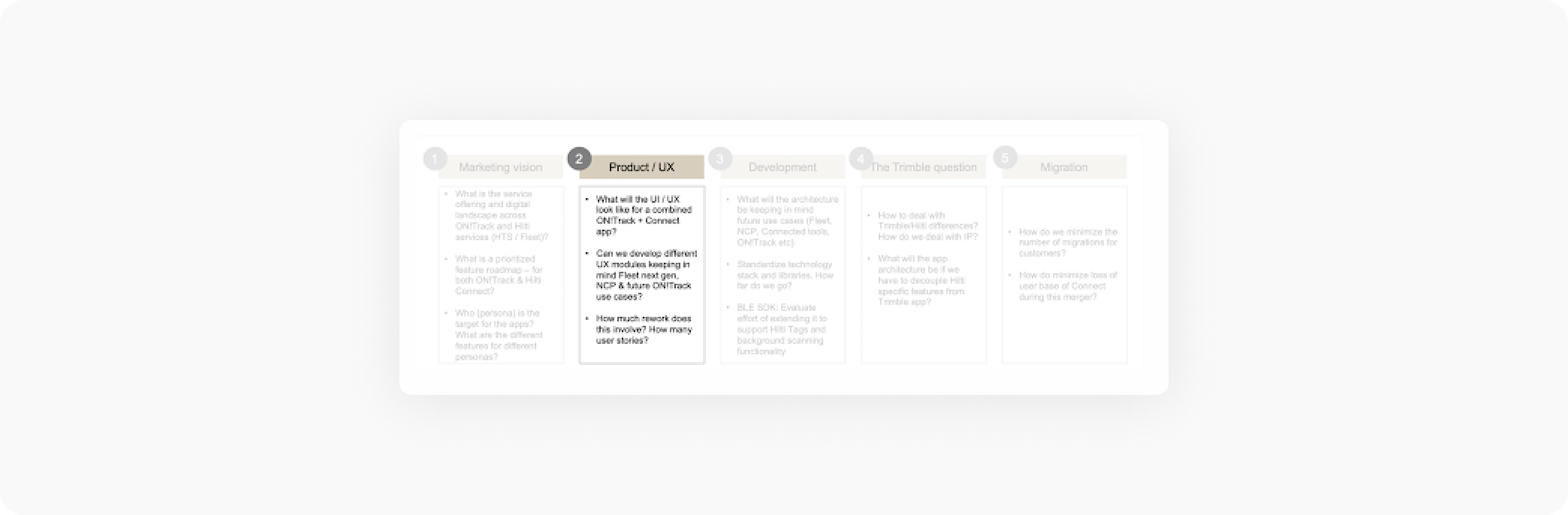
There were multiple work-streams moving in parallel. The marketing team identified 3 key questions I was responsible for answering:
- How could the merged app work for our customers?
- Is it possible to provide a personalized experience based on different customer criteria?
- What would be the net new effort for this?
UX challenges
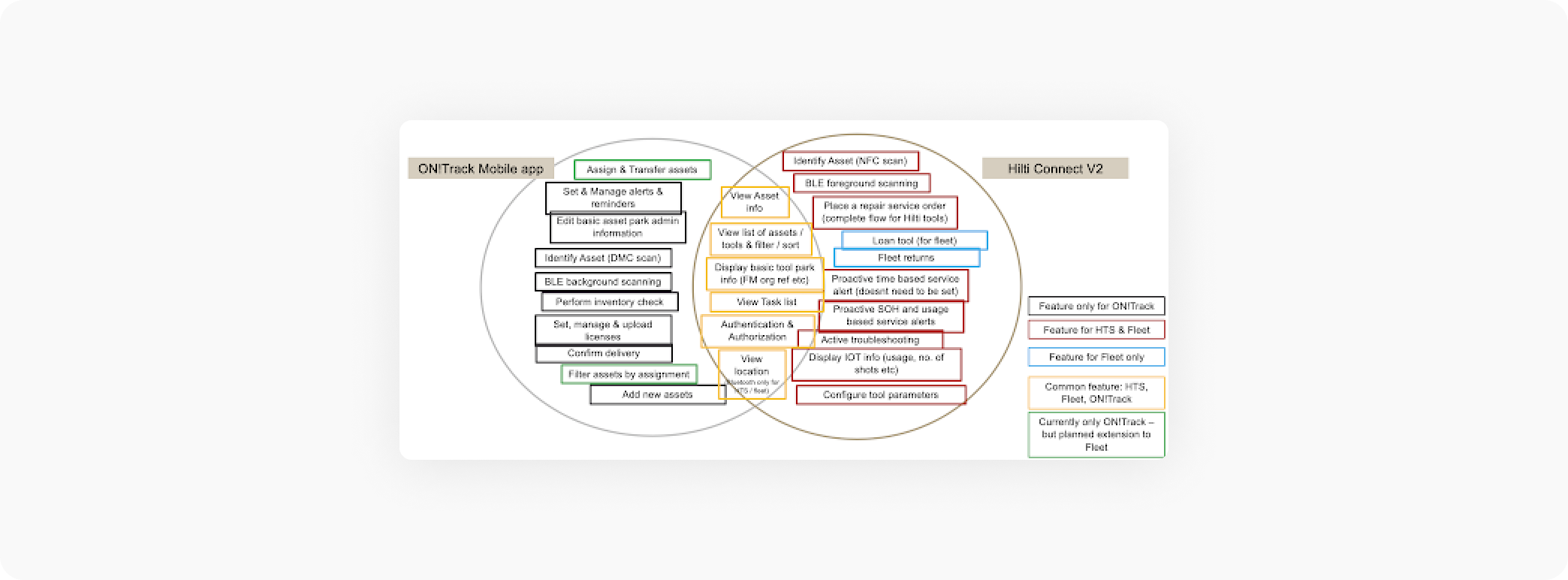
Together with marketing and product management, I hosted a workshop where we first created a mind map of the of the things to consider regarding the merger. Next, we grouped related items into an affinity diagram. From there, we used dot-voting to identify the most pressing and relevant issues that we should consider while designing. The diagram below is one output from this workshop highlighting the relationships of the various product features and customer types.
After the workshop, with this information I performed my own UX analysis where I uncovered and prioritized the top UX challenges to inform the design concepts. The presentation of these 5 key UX challenges informed and aligned key stakeholders on the issues we would need to tackle during design and testing.
- Login vs Anonymous mode: How to make the user understand that they should login - especially ON!Track customers?
- Roles / Permissions: Which user (ie. warehouse manager, worker, etc.) and customer type (ON!Track, Fleet, HTS) sees what content? Larger initial configuration, in-app onboarding burden.
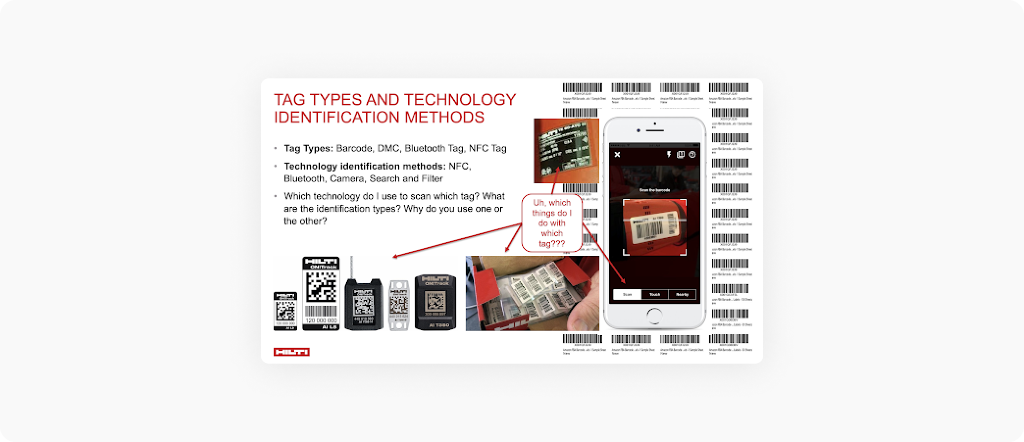
- Tag Types (Barcode, DMC, Bluetooth Tag, NFC Tag) and combining technology identification methods (NFC, Bluetooth, Camera, Search and filter): Which technology type do I use to scan which tag? What are the identification types? Why do you use one or the other?
- Actions on Assets: How do we present the increased number of primary actions (Service, Transfer, IOT use case) and secondary actions (edit, add photo, add document) as a user can take on an asset?
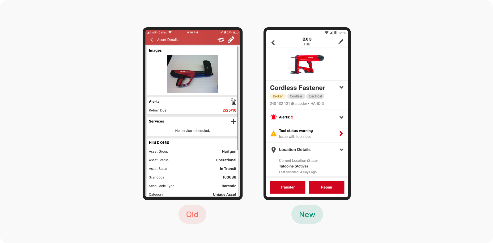
- Asset Details: How to navigate through all the additional information which isn't relevant to my current goal?
Prototyped Solutions
- I focused on the 5 key workflows to test the UX challenges which were previously identified
- We went through multiple iterations with key internal stakeholders prior to testing
- We had 4-translated versions of each prototype for our various testing locations (UK, Sweden, France, Germany, Switzerland)
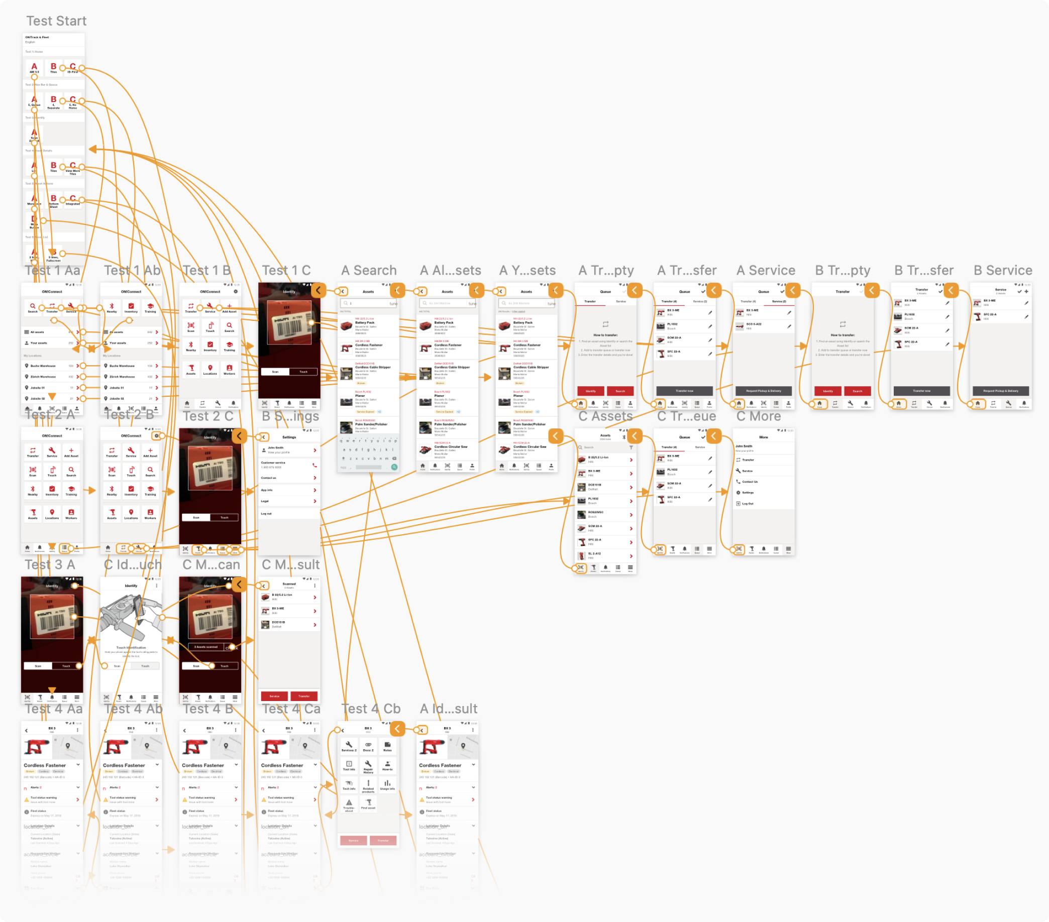
A/B User Testing
Using a combination of testing techniques we were able to test with over 300 participants. We held the questions, prototypes and A/B format of the testing constant so we were able to compare responses across different techniques.
The unmoderated internal stakeholder tests allowed to to quickly gain statistically significant insights and preferences so we could refine and focus the customer tests.
The moderated customer tests allowed us to gather the most critical 1st degree feedback and ensure were weren't re-enforcing any biases or assumptions we had as internal stakeholders.
And lastly, the moderated guerilla tests allowed us to bolster our customer participant numbers, incorporate another user group which is typically less represented in our testing, and explore another testing technique not previously used at Hilti.
276
25
7
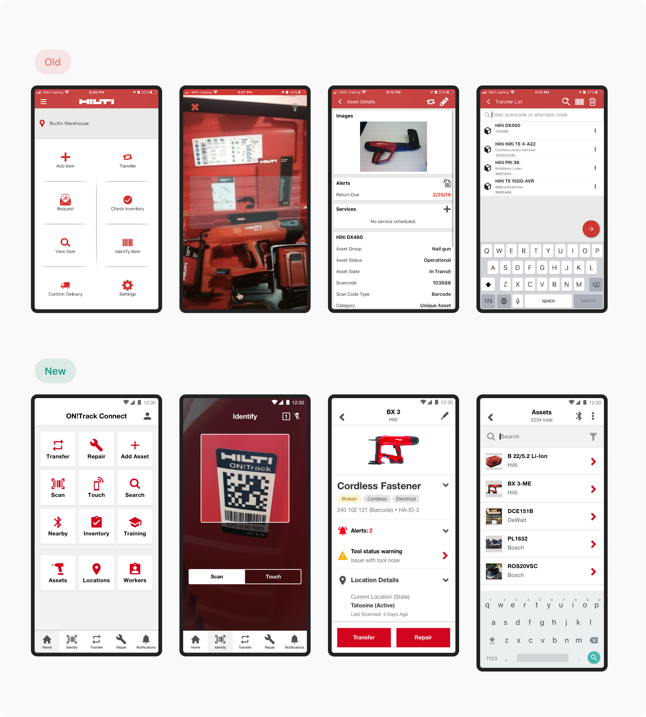
- Participants strongly favored the familiarity and discoverability of the tile-based home screen as opposed to the efficiency of the scan-first home screen or the consistency with with web app modeled home screen.
- Participants preferred integrating secondary actions into the asset detail page as opposed to having them all accessible from an action panel or accessible via a more icon/button. This significantly improved discoverability and speed.
- By combining various scanning methods into a single screen and using non-technical terms like scan, touch and nearby rather then barcode, DMC code, bluetooth, or NFC, participants were more successfully able to associate the correct scanning method with the given tags.
- Disabling features, using explainer modals, and putting login CTAs at correct places significantly increased the participants' comprehension of the app's current state and login purpose.
Incorporated Learnings
Based on the results, I iterated on the designs. Despite having a strong personal preference for one of the navigation concepts, the users and the business preferred otherwise. The designs were then added to the prioritized backlog and the current design and development efforts were adjusted to incorporate changes.
Impact
Demonstrated UX feasibility of merging applications
Significantly reduced risk of poor performing features